
COmpany rebrand
Hereford Racket Centre
A bold, modern identity for a community-focused sports centre, from signage to shirts.
Studio Mission: To modernise and unify the centre’s visual presence while maintaining its local, community feel, giving it a fresh edge that would attract new members and energise current players.
Rebranding with purpose
The original brand felt outdated and inconsistent across materials. The goal was to elevate the visual identity without losing the approachable, sporty vibe that makes the centre a local favourite.
We needed a visual system that worked everywhere, from a court-side poster to a printed tee to 10 feet of external signage. That meant designing with both flexibility and impact.
The creative process
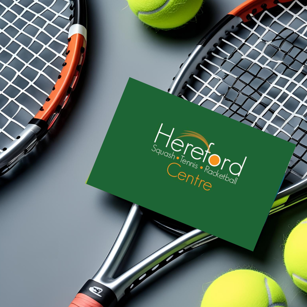
Logo & Colour Update
- Refined the existing logo into a sharper, more scalable version
- Introduced a bold, sporty colour palette — vibrant but not overwhelming
- Created clear brand guidelines to ensure consistent usage across signage, apparel, and print
Typography & Layouts
- Selected a strong, modern sans-serif font for headlines and signage
- Used modular grid layouts for event flyers, timetables, and notices
- Balanced clarity and energy, sporty, not shouty
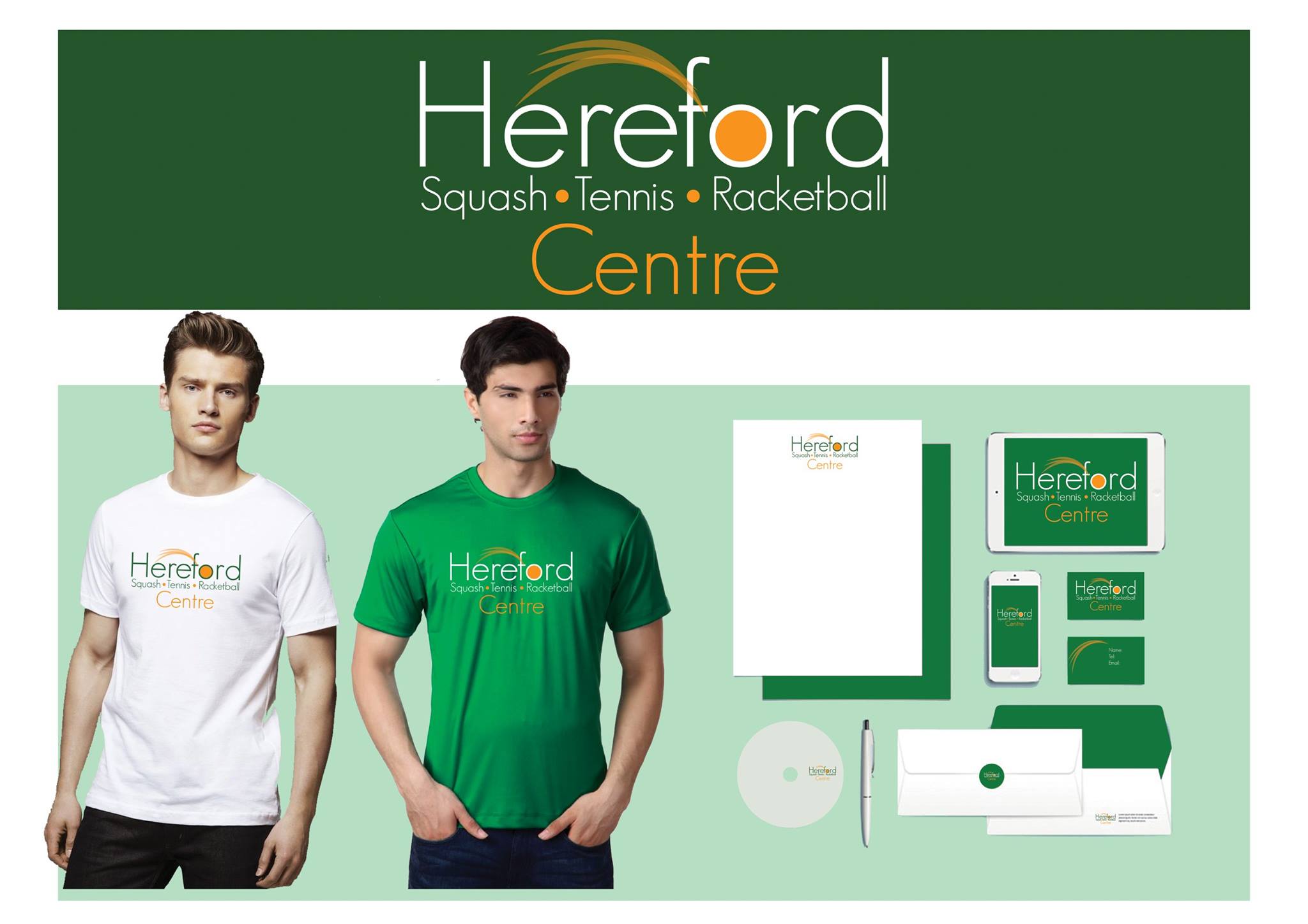
A multi platform project
Apparel Design
Designed branded T-shirts for staff and club use
Building Signage
Large-format external signage for visibility from the road
Internal directional signs and poster boards
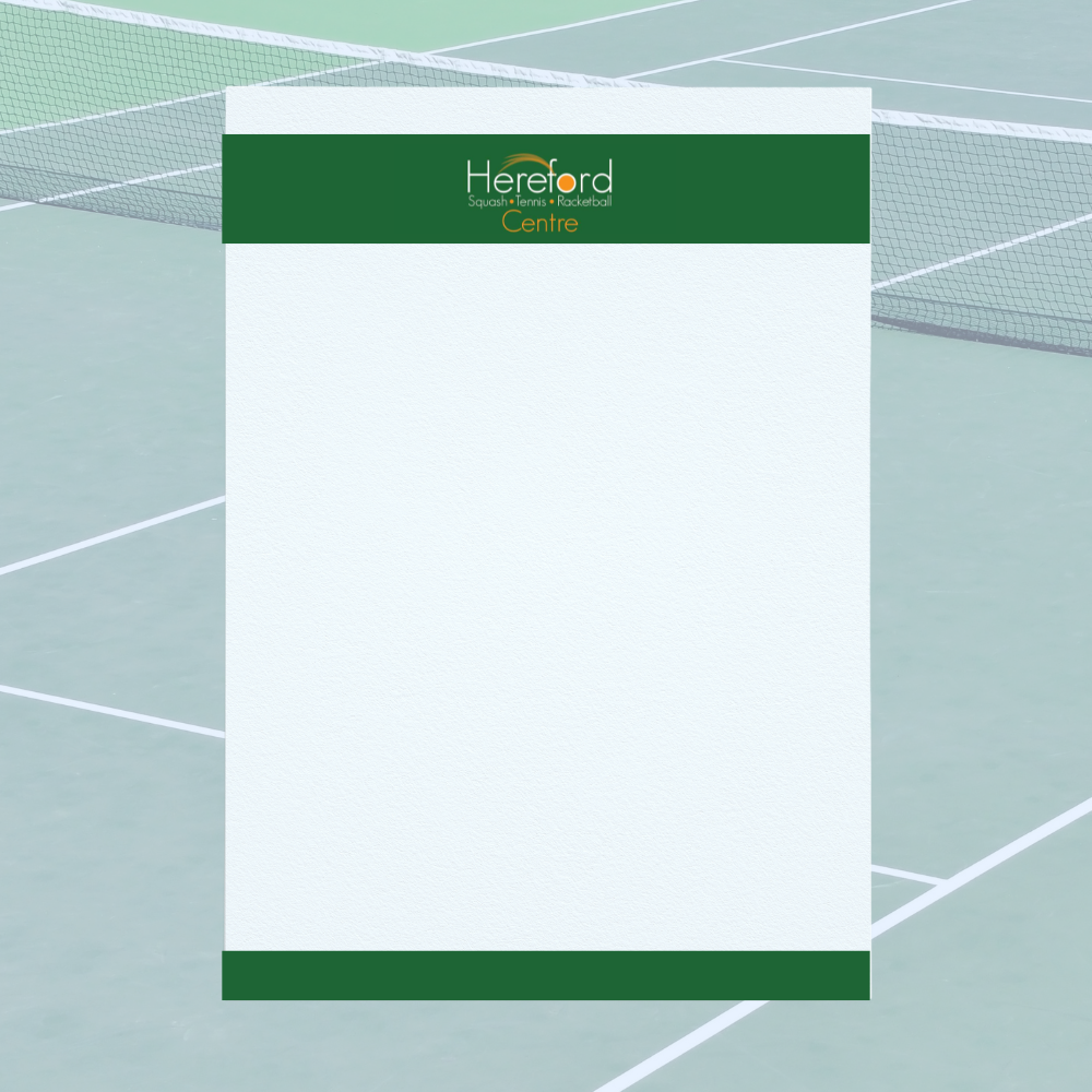
Print Materials
A variety of print-ready templates were created
The impact
The refreshed branding instantly lifted the centre’s visual presence, creating consistency and energy across every touchpoint. Staff looked unified, signage drew new attention, and printed materials became easier to read and more enjoyable to interact with.
This project is a perfect example of multi-format branding done right, bold, functional, and rooted in purpose.
![]() Follow along on Facebook: @HerefordTennisSquashRacketCentre
Follow along on Facebook: @HerefordTennisSquashRacketCentre